
Packaging is something we’re bombarded with on a daily basis. Creating an eye-catching packaging design that suits the product, stands out on crowded shelves, and doesn’t cost a fortune to produce is a real challenge.
In this post, we’ve rounded up standout examples of packaging designs to guide your efforts. For more inspiration, jump to page 4 where you’ll find a list of handy free online packaging design resources.
Now more than ever, packaging design matters. A economic struggles and rising concern for environmental issues have added new challenges for packaging designers. Read on to explore the design trends shaping the packaging landscape right now.
01. Manos de Cacao
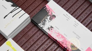
Anagrama made a range of stains by hand, using different tools, for this unique packaging
Premium bean-to-bar chocolate brand Manos de Cacao wanted packaging that felt simultaneously timeless and eye-catching. Inspired by the company’s local production process, Mexico-based studio Anagrama combined messy handmade textures with a vibrant colour palette and clean layouts. The result is a new visual system for the brand that places sophistication at the forefront and evokes an appropriately organic undertone.
“Making a ton of stains by hand with different tools and choosing the right ones for each box was challenging,” says David Gutiérrez, partner and creative director at Anagrama. “However, this was also the most fun part of the process.”
02. Hardy
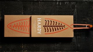
The packaging for this premium smoked salmon is made from raw micro-corrugated cardboard printed in UV colour
“Third-generation family business Hardy specialises in smoked salmon. The company turned to Portugal-based studio This is Pacifica to design stationery, packaging and a website that would communicate the premium quality of its product. “It’s a long-lasting process that can’t be rushed. From salting to smoking, each stage is executed to perfection. So we created the idea of Hardy ‘Smoked Masterpieces’,” explains creative director Pedro Mesquita.
The identity combines two main elements: an abstract salmon symbol, and a fun, sharp wordmark that could have been cut by a knife. “The packaging was treated as an extension of the brand,” says Mesquita, “and is entirely made of raw micro-corrugated cardboard printed in UV colour.”
03. Thomas Kosmala
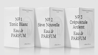
Concrete kept things abstract to suit the conservative Middle Eastern market for this perfume
Looking to break into European and global markets, emerging perfume brand Thomas Kosmala tasked Toronto-based agency Concrete with a complete brand overhaul. The new packaging marries classic with contemporary, unexpectedly wrapping a sophisticated custom typeface around the edges of the perfume box and over a subtle emboss.
“The brand needed to appeal to both Middle Eastern and Western audiences,” explains chief creative officer Diti Katona. “Sensuous, provocative and sometimes raw photography conveys the depth and richness of the scents, but is abstracted in the packaging to comply with the conservative sensibilities of the Middle Eastern market. A more explicit use of the imagery is employed in digital media, and it’s more subtle in print experiences,” Katona adds.
04. Wild Island Sacred Tree
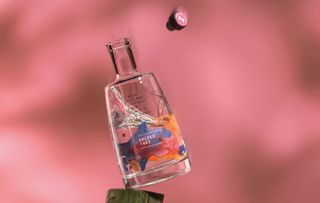
Thirst created a juicy colour palette using watercolour
After designing the bottle for Wild Island Gin, drinks branding studio Thirst was tasked with designing a second edition, Wild Island Sacred Tree. Inspired by the gin itself – which is infused with hand-gathered botanicals from the small Scottish island of Colonsay – the studio looked to the island’s ripe bramble vine to create a deliciously juicy colour palette using watercolour.
“The brief was to capture the essence of autumn on the island, and the wonderful bounty of berries and botanicals it produces,” explains creative director Matt Burns.
Thirst paired the autumnal colour palette with a simple wordmark that gives a nod to the island’s Viking heritage. When it came to applying the fluid watercolour design to the bottle, the texture was printed on both sides of the transfer, enabling it to be viewed through the distortion of glass and liquid. “This allows the watercolour to take on new life, constantly changing as the bottle is rotated,” adds Burns.
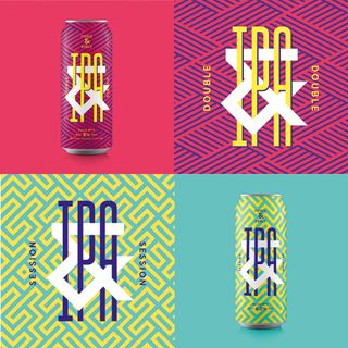
05. Halo
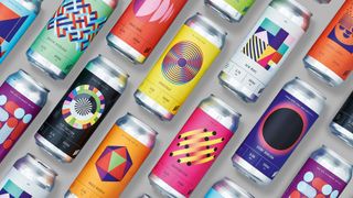
Underline Studio went for an energetic, slightly rebellious look for this brewery packaging
Halo is an adventurous brewery that takes the traditional recipes of rare styles of beer and experiments with the ingredients. With a taproom and bottle shop that welcome inquisitive visitors, the brewery needed an approachable brand that matched its unconventional sensibilities.
“We created a logo, labels and packaging that use geometric patterns in unexpected colours, resulting in a look that’s energetic, modern and a bit rebellious,” explains Claire Dawson, creative director at Underline Studio, the studio behind the project. “This direction was very intentionally chosen as a way for Halo to stand apart visually in the craft beer space.”
Dawson admits it was a challenge to keep each label unique while still being recognisable as part of a larger system. “But finding abstract ways to graphically represent each of the beers was our favourite part of the project,” she adds.
06. Juice Society
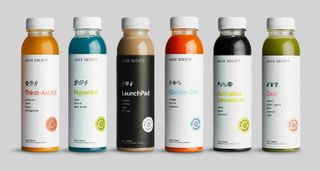
This juice branding balances scientific iconography with a touch of whimsy
Third-year design student Ryan Hicks was tasked with revamping the visual identity of Austin-based juice bar Juice Society as it expanded into the wholesale market. “They felt that their previous identity was too rustic and gave an outdated reflection of their upbeat spirit,” explains Hicks, adding that the company has a philosophy of promoting realistic balance when it comes to wellness.
“I decided to convey this playful attitude through an ecosystem of whimsical, somewhat scientific iconography that hinted at the juice’s benefits, but provided some element of optimism,” he says. “I also wanted to convey the brand’s unconventional approach to the health realm, so to stand out on refrigerator shelves and catch shoppers’ eyes, I chose to design the labels to be as minimal as possible.”
07. Stefano Sauces
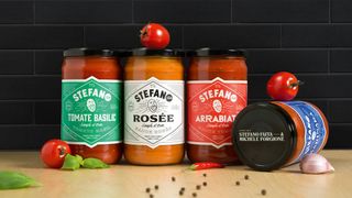
Each sauce has a unique typographic treatment
Montreal-based agency lg2 took an original approach to its branding of the first ready-to-eat products from well-known chef Stefano Faita and his partner Michele Forgione. Featuring a jovial, energetic caricature of Faita, the identity gives each sauce a unique typographic treatment – with nutritional and legal information presented in an unusual vertical fashion outside the shape.
“It was a major challenge to differentiate the brand in this type of category, where all brands merge into one,” says David Kessous, creative director at lg2. “The concept’s originality produced a real, appealing identity and packaging that leaps out.”
08. Fierce & Noble
Halo wanted brand packaging that would jump out from the shelf
Bristol studio Halo was approached to create a strategy, name, brand identity and packaging for a new craft brewery in St Werburghs, Bristol. The name – Fierce & Noble – represents the brewery team’s fierce independence and respect for the heritage of the craft, while the bold creative, custom type and bespoke patterns reflect the local vibrancy of its location.
“The product needed to jump out on bar and shelf,” explains Halo design director Andy German. “And what with the brewery being in a creative vibrant area of Bristol with other craft breweries in it, it made sense for the building to stand out and be seen. The main pattern for the brand was based around the ampersand we made – my eyes went a bit fuzzy creating this one.”
09. Colors
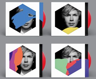
Music fans can customise their own record sleeve by moving around the coloured transparencies
Musician Beck’s latest album Colors sports a customisable record sleeve created by designers Jimmy Turrell and Steve Stacey. Formed from layers of different die-cut coloured transparencies, the cover can be assembled into a bespoke sleeve by listeners.
“We decided on a route of colour and shape – simple and strong,” explains Turrell, who was art director and video director on the project. “We tried not to set too many restrictions on where we went with this in the initial stages. We started looking at a whole range of things for inspiration – childhood games like Ludo and Connect 4, old VHS and cassette packaging, all the way through to artists like Bridget Riley and Piet Mondrian, and Beck was really open to us experimenting. Seeing it all out there – and the positive feedback it’s been getting – is really satisfying.”
10. Artisan
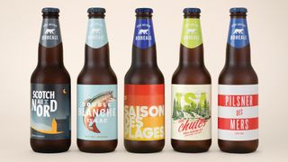
lg2 wanted to up Boréale’s credibility in the microbrewery space
When Québec-based microbrewery Boréale launched a new series of beer, Artisan, it tasked creative agency lg2 with designing the new identity. “The client’s main objective was to restore the brand’s credibility among fans of microbrews,” explains graphic designer Marie-Pier Gilbert. “We had to establish Boréale in a niche segment without detracting from its mass appeal.”
lg2 worked hand-in-hand with the master brewer. For some products, the recipe influenced the artistic direction; in other cases, the reverse happened. “For example, for the Pilsner des Mers, the name and design were developed first, which then inspired the master brewer to give the recipe a salty note,” says Gilbert. “Flexibility and listening were a big part of the teamwork.”
11. Moses Lake Cellars
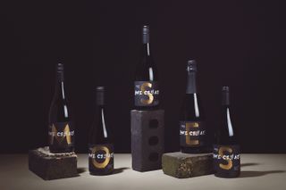
Thirst specialises in the craft drinks industry, and it’s currently exploring new techniques and executions in packaging design as part of its Studio Series. This range of bottle labels for luxury wine brand Moses Lake Cellars was designed to work as a collective on a dinner table.
«We wanted to explore typographic lettering techniques that were bold and youthful, yet still carry the luxurious qualities associated with wine,» says Thirst. To give an extra touch of luxury, the studio used heavy paper stock, and each label is double folded, white onto gold.
12. CS light bulbs
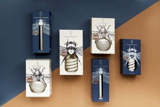
Everyday products such as light bulbs tend to lend themselves to fairly utilitarian packaging, but these, produced by Belarus electrical company CS, boast beautiful boxes that turn the product into an important part of the packaging design.
Designed by Angelina Pischikova, with line illustrations by Anna Orlovskaya, this amazing packaging uses detailed drawings of insects, and the bulbs themselves are paired with certain bugs depending on their shape and size. Long, thin bulbs are stored in dragonfly boxes, while the coiled stripes of an energy saving bulb become the abdomen of a bumble bee.
13. Dolce

Located in the heart of Belgrade, Serbia, Dolce is a cake shop that combines traditional techniques with a modern approach. Independent design studio Metaklinika was tasked with creating a range of packaging for the brand. The whimsical result takes inspiration from Baroque aesthetics, and uses iconography based around the theme of Alice in Wonderland.
14. Leafs by Snoop
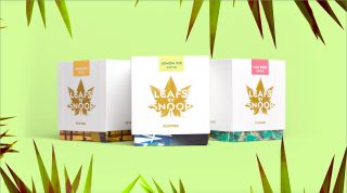
With cannabis slowly becoming less and less illegal in the USA, cannabis branding is increasingly becoming a thing, complete with packaging to match. Snoop Dogg brought in none other than Pentagram to design the brand identity and packaging for his line of cannabis products: Leafs by Snoop.
Stepping far away from the idea of furtively buying a grubby little bag of greenery, Pentagram’s designs include a distinctive leaf-based logo (including an animated version), luxurious weed boxes and a range of edibles including six chocolate bars and cannabis sweets called, of course, ‘Dogg Treats’.
15. Colour me Blind
For her graduation project at , graphic design student Alexandra Burling wanted to see if it was possible to create an aesthetically appealing packaging design for the visually impaired. Following her research period, she decided to focus on groceries.
“I wanted to give blind people the liberty of doing something so obvious as going down to the supermarket and buying milk,” explains Burling. «The aim was to provoke discussion and pave the way for innovative thinking about how packaging design can appeal to more senses than sight.»
[More innovative packaging designs]